Logo Design
In early 2016 GCP Applied Technologies (NASDAQ: GCP) separated from its parent company W.R. Grace® to form a new wholly owned entity worth $1.5B annually. Part of this entity – Darex® Packaging Technologies — which has been a leading supplier of can sealants, closure sealants, can coatings and closure coatings to the packaged food and beverage industry since 1922 when they invented the first lead-free can closures. The long standing market leader is well known but the brand was been visually fragmented.
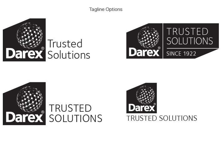
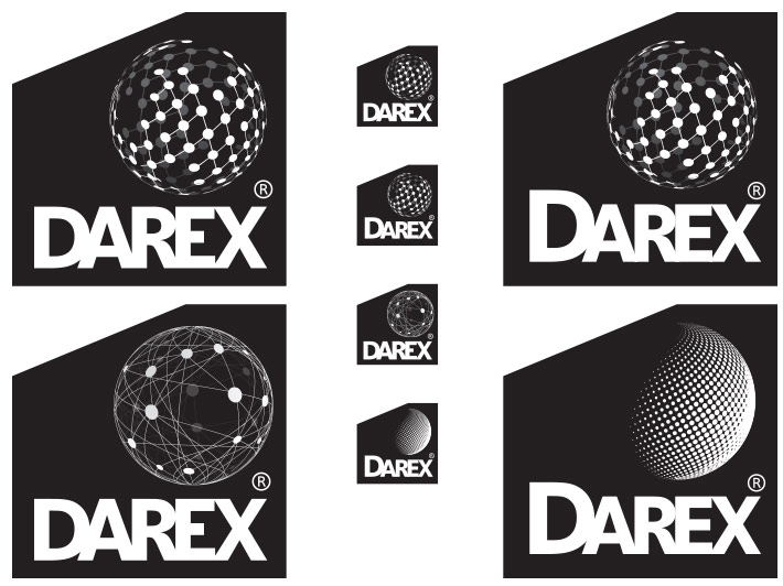
As part of the corporate separation GCP wanted to energize existing Darex product line name recognition with a new logo. These logo options work to leverage customer confidence, perceived strength and renowned technical service networks. The network of ‘droplets’ on the chosen option represents much more than the liquid form their products are delivered in but also the expanse of their global service network and supply chain. The slash cut box the creating the shape of the logo provides structure and foundational building block. The 22.5˚ slash mimiks a defining brand element of the parent company’s logo and acts as a familial element for future product line logos.
Category: Branding,
Client: GCP Applied Technologies/Darex Packaging Solutions
Agency: GCP Applied Technologies


